I thought I would share some of the processes that I use to write, particularly with Atticus in mind. If you haven’t heard of it, it’s a formatting/writing piece of software that shows you the results of your formatting changes on the fly. It exports files ready for Amazon and several other non-UK-centric sites. (Barnes & Noble, etc.) I use it almost entirely to write for Kindle, but the files produced are pretty much standard. First, the hard sell. It costs in UK money around £149. That’s for life. Atticus does not run on the subscription format, but if you aren’t sure, they offer a 30-day refund guarantee. You can pay by Paypal too, including the three split payments option if it is available to you. Is it worth it? For me, absolutely! First of all, it saves me an enormous amount of time in formatting, making my books prettier and easier to use. You can use it to write as well, with a couple of nifty little tools to help you in targeting and so on.
First of all, however, I thought it best to describe how I usually write. I do all my writing in google docs. On there, I have a few extensions – writing targets, thesaurus and, of course, up-to-date word count. On there once done and on the first edit, I will use Grammarly to give it a look at the text once the first edit is done. Effectively, Grammarly is the second edit after I have completed my manual first edit. Once done, it is transferred to Word and then sent off to editors to have a look at. Once back, I edit again, then put it in a draw until I am ready to give it a fresh pair of eyes. That’s the process in total.
Atticus allows you to write inside it, with an instant formatting view on the right side for numerous devices – all the Kindles and so on, as well as a print preview. This is invaluable and one of the program’s best features, as you can see the results of any formatting changes instantly. Have a look at the picture below – it’s running full screen in the picture. Atticus only needs you to be online to log in. Once in, you can drop your connection, and the next time you go online, it syncs any changes to the cloud seamlessly. Next on to the next function Atticus: writing.

So, as I said earlier, Atticus has two main functions: formatting and writing. We will return to formatting for the most exciting part of Atticus in a moment, but let’s look at the writing function next. To be honest, it feels very much like using Chrome Docs, with all the formatting functions along the top. A writing timer and Writing Habit for setting targets are built in, so no fiddling around with installing Chrome extensions. It’s with mentioning at this point that there is a theme-based override to change justification, hyphenation, line spacing etc. which we will come to in a moment, so it’s best to ignore the formatting in the screenshot below. Of course, if you want to see what it looks like on any device (and print!), then just switch back to formatting on the top. You can actually write this way, so you can instantly see how what you are typing looks like.
In addition, it is worth mentioning that Atticus, by default, creates a table of contents and front matter (cover, copyright and title pages), and also allows you to add a foreword, afterword etc. It really is very straightforward and easy to use.

So now on to the exciting bit, and the part of the program that I personally find most exciting – formatting and themes. Themes affect how your book looks. The customisation here is huge and comprehensive. There are seventeen built-in themes, but – and here’s the great bit – you can create unlimited custom themes yourself. Have a look at the results of a few paperback themes I used/created below. Aren’t they something?

So let’s have a look at the themes screen. There is a lot to take in here, but it’s hugely comprehensive. It’s worth saying right here and now that I am not an expert at this. Just a complete novice. Yet here, the themes allow you to add images to your page as full-page, header or whatever takes your fancy. The brilliant part is you don’t have to worry about bleed. Your images can even span pages. Want a two-page map at the front of your fantasy book? Not a problem. There is even an online tutorial to show you how to do it. There is a learning curve, but it’s not a steep one, and the online tutorials in video format are numerous, and all give excellent advice.
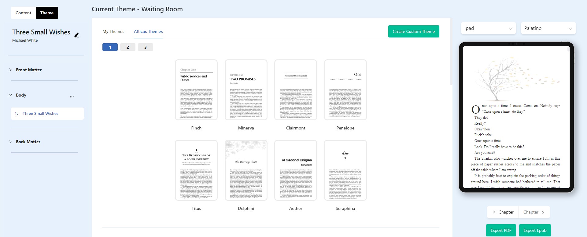
Above is the first theme screen. You can switch between themes and instantly see the differences in your text and/or pictures instantly as you move between the themes in Kindle format, print and other e-readers too. Custom themes are created here, too, by using the custom theme at the top and then changing the settings I am about to show you. The next scroll down gives us this:
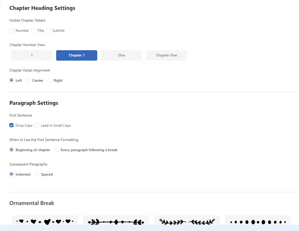
As you can see, you can change chapter heading types, subtitles and drop caps, as well as what kind of ornamental breaks you want. You don’t have to use them, of course, but there are dozens built-in, and yes, you can upload your own image files to make your own custom ornamental breaks too. You can even control their width. Less is more here – try not to make them too big, or they just become obtrusive. The great thing is the preview screen on the right will show you any changes you make as you make them. Next, scroll down:

Here we can change the start page (ebooks only, obviously) if you want your reader to jump straight into the action and also change how you want your headers/footers to behave. Also, note the large print option. This is invaluable because it instantly sets your book to all large print standards, potentially opening up an entirely new market for your work! Next:
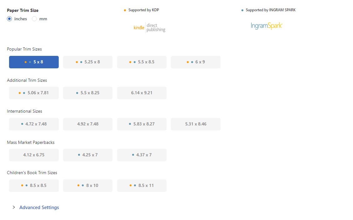
Trim sizes! The bane of our existence! It’s worth noting that in the advanced section below, you can customise these but beware – Amazon are very unforgiving, but then you probably know that already! Next:
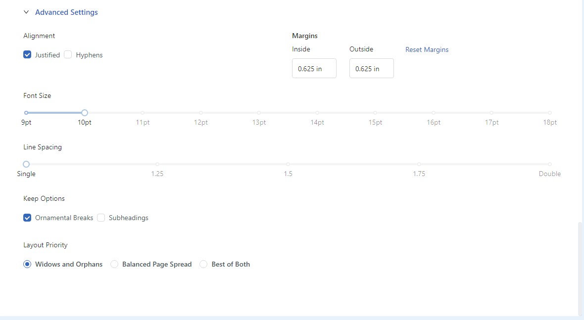
The final advanced settings. Here you can change the font size, whether to use those ornamental breaks or not that I mentioned earlier, and margin sizes. Line spacing is included, as is whether you want hyphenated words to be in your text or not. I prefer them off – it looks neater.
Conclusion
So, as you can see, the options are comprehensive, the formatting intuitive, and the results quite spectacular. I have but given the briefest of run-throughs here – the real fun begins when you start creating your own themes – but it should be enough to make your mind up about the program. Personally, I find it invaluable. So what is the support like? Well, on day one, I had a silly query (I won’t embarrass myself by repeating it) and so fired off an email to Atticus support through the link in the program. It was one in the afternoon in the UK, so I suspect it was either very early or very late in the afternoon in the US, but I had a well-informed, polite response in three minutes! You can’t say fairer than that! The online tutorials are excellent, too. The program is updated constantly too. Next in line are collaboration options, dark mode and lots more too. All in all, it’s a spectacular piece of software, well worth the money, and better looking books have already led to an uptake in sales. In a few words, if you want easier writing and formatting options and want to make your books look really good, Atticus is definitely worth a look. There is nothing else on the market like it.
Disclaimer: It’s worth pointing out that I have no connection with Atticus as a company other than as a customer. I have received no incentive to write this review whatsoever. My opinions on the program are entirely independent. If you need any further information, my email address is linked on my main site: http://www.mikewhiteauthor.co.uk , or you can email me direct on mike@mikewhiteauthor.co.uk
